Before and After: Downtown Victorian

Living Room

Before: For our client’s living room, the goal was to update and modernize the space, while maintaining the charm of the original architectural elements. The client also wanted a way to improve the functionality of her living area, as there was a seldom used door and nook that needed attention to unify the space. The fireplace was in need of a facelift, and protruded into the room, creating cramped space. 

After: The Living room entered the modern age with a healthy dose of lovely teal paint. Adding built-in bookcases, changing out the fireplace to a streamlined model, and de-emphasizing the door with curtains allowed an organic layout to take shape in the room. Brass accents and a colorful rug made the space warm and inviting, with a modern touch.

(Browse this living room and more inspiration images over on Shutterfly’s 100 small living room ideas interactive)

Dining Room

Before: The dining area had great potential, just look at those coffered ceilings and incredible wainscoting! However, it felt cramped and dark because the alcove wasn’t being used to its full potential. The color wasn’t helping either, it needed a refresh to become the inviting space it was always meant to be.

After: We designed a custom built – in dining bench, which instantly made the space feel more expansive. It also allowed our client to use a gorgeous vintage table they already owned that brought the whole room together. The deep grey tone plays well off the teal in the living room, while molded plastic chairs and a bright rug bring an updated and eclectic feeling to the space.

Kitchen

Before: The kitchen underwent the biggest transformation. Kitchens in Victorian homes tend to be small and this one was no exception. It was in need of an overhaul to make the space lighter, brighter and streamlined for our client.

After: With the new layout, we were able to give our client another seating area and more storage in the kitchen. The shaker style cabinets are the perfect balance of traditional and contemporary and don’t feel out of place in the home. A soft color palette of white and greige brightened the space, adding visual volume to the kitchen. In addition, a balance was created by using modern bronze hardware and traditional elements, like the farm sink. Brass mid century lighting fixtures echo the hardware found in the living room, harmonizing the new remodel across the three spaces. This is a make over that will serve the home well for years to come. 

See all the images of this remodel in our Portfolio, and make sure to follow us on Instagram for more behind the scenes shots.  


Color Analysis: Antique Door

This snapshot was taken on a recent trip to Mexico, where we traveled through Tulum and Merida. The exterior door and plaster color combinations there are stunning, and this blue-green beauty really stood out. This palette works so well because the vibrant aqua and green tones are anchored by the light and dark grey. A sprinkling of baked clay brown adds a visual counterpoint that  makes the other tones pop. The links below will tell you exactly which Benjamin Moore paint colors we used to create this palette, and may even inspire you to inject the vibrant hues into your own home. For more color inspiration, follow us on Pinterest and Instagram

Color Analysis Door.jpg

//1//2//3//4//5//6//7//

Color: Green

Green is an often soothing color that many people utilize in their interiors. In particular soft greens are universally appealing tones that people use both inside and out. However, they can feel like a default choice rather than a statement. This season, we are loving the deeper jewel toned greens and green-greys that leave a lasting impression. Below are some of our favorite images that make this appealing tone seem fresh and new.

Follow us on Pinterest and Instagram for more color inspiration

//1//2//3//4//5//6//7//8//9//10//11//12//

Color Analysis: Farmers Market Flowers

If you follow us on instagram you probably know by now how much we love heading over to the Downtown Farmers Market every Wednesday and snapping photos of all the beautiful flower arrangements. We decided to take it a step further by finding actual Benjamin Moore paint colors that match the gorgeous hues of these natural beauties. 

See our color analysis below with links to the paint colors starting from left to right:

 //1//2//3//4//5//6//7//

Color: Yellow

Yellow is having a moment in fashion and interiors this fall. For some people, this trend is wonderful, but others stay away from the hue at all costs. We love embracing color, it feels fresh to use a bold hue in fall when muted tones normally reign.

Below, take a look at our favorite yellow inspiration images that highlight the bold power of this color:

Follow us on Pinterest and Instagram for more color inspiration 

//1//2//3//4//5//6//7//8//9//

Misahara Jewelry, The Plaza Hotel, New York NY

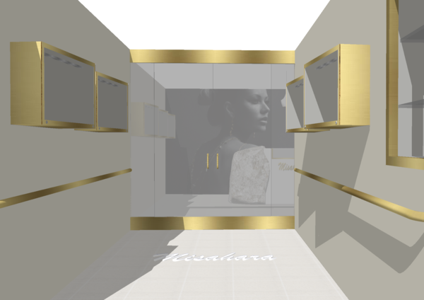
We are so pleased to share the second store we designed for Misahara Jewelry in the Plaza Hotel, New York.  Take a look at the first store we worked on for Porto Montenegro here . While we employed a similar design scheme in both stores, we made a few changes in response to the physical space as well as the different geography and climate. 

Before we got our hands on the space:

Rendering for the proposed design:

After:

Rendering:

After:

Before:

Rendering:

After:

Before:

Rendering:

After:

Rendering:

After:

And a few more beautiful detailed shots:

To see progress shots of our other projects, follow us on Instagram. 

To see progress shots of our other projects, follow us on Instagram

Mood Board: Home Office Remodel

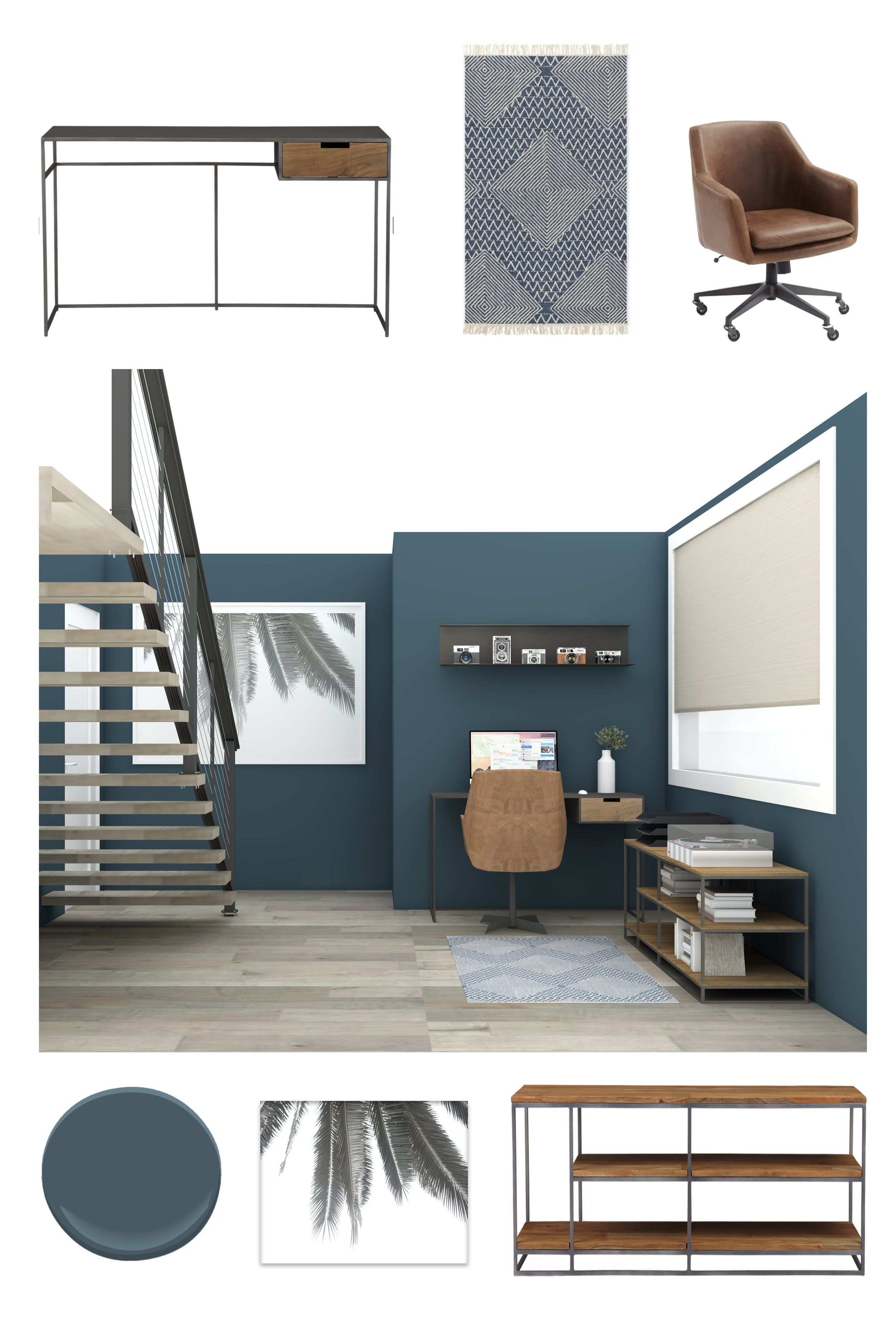
Back in April we shared some details on a client who was building a second story on their home to create a master suite. The location of the new staircase will make their old bedroom the perfect place for a home office. The new oak plank stairs will appear to be floating on the blackened steel and cable railing. This updated staircase will give the room a modern industrial feel. The metal and wood furniture we chose continues the industrial tone throughout the room, while the strong teal walls ground the space and gives a sense of calm to the room. Take a look at our mood board below to see how we will dress the rest of the space. 

Above clockwise from upper left: //1//2//3//4//5//6//

The current state of destruction:

Make sure to follow us on Instagram to see more progress shots and stay tune for full before and after on the blog! 

Color: Blush

Blush is one of those beautiful colors that has been popping up everywhere from interiors to fashion. The softness of this color lends itself to a more muted design aesthetic. Alternatively, when paired with a bold color the combination can end up feeling quite 3 dimensional and dramatic. 

Check out a few images that continue to inspire our love for the color blush. 

Image sources from top to bottom: //1//2//3//4//5//6//7//8//9//10//11//12//13//

Follow our Color Pinterest board for new pins. 

Universal Audio Lobby Progress

We have been working with Universal Audio to update their headquarters in Scotts Valley, CA.  UA reproduces classic analog recording equipment and designs new digital recording equipment. They have worked with copious world-renowned recording artists over the past 60 years.

Their rather ubiquitous 1980's office building also functions as a recording studio and the manufacturing facility for their products. Fuse, a local architecture firm in Santa Cruz, had originally implemented a structural facelift for the old Seagate premises, which gave us a great foundation to work from. By spring 2016 UA was ready for the final layer of detail to be implemented in their lobby.

The client wanted us to create an inspiring and exciting entrance for their employees and visitors alike.  Below is a walkthrough of our design proposal:

This is the staircase BEFORE:

Before- Stairs:plant.jpg

The oversized dusty ficus dominated the entire space:

This is the staircase AFTER: 

The inherited materials of the concrete floor combined with the reclaimed wood really worked in our favor. We wanted to clean up the palette in this space and allow the warmth to come from the wood. The existing yellow and brown color on the walls felt like they were competing with one another. A more contemporary palette of crisp white and charcoal gray was implemented. We also wanted to update the plants in the space, get rid of the large ficus plant which is so synonymous with typical office design and start introducing more mature succulents to the existing beds, swapping gray pea gravel out for black river rocks. 

This is one of the 4 doorways to the interior offices BEFORE:

Entrance ways to offices AFTER:

This is the kitchen on the mezzanine BEFORE:

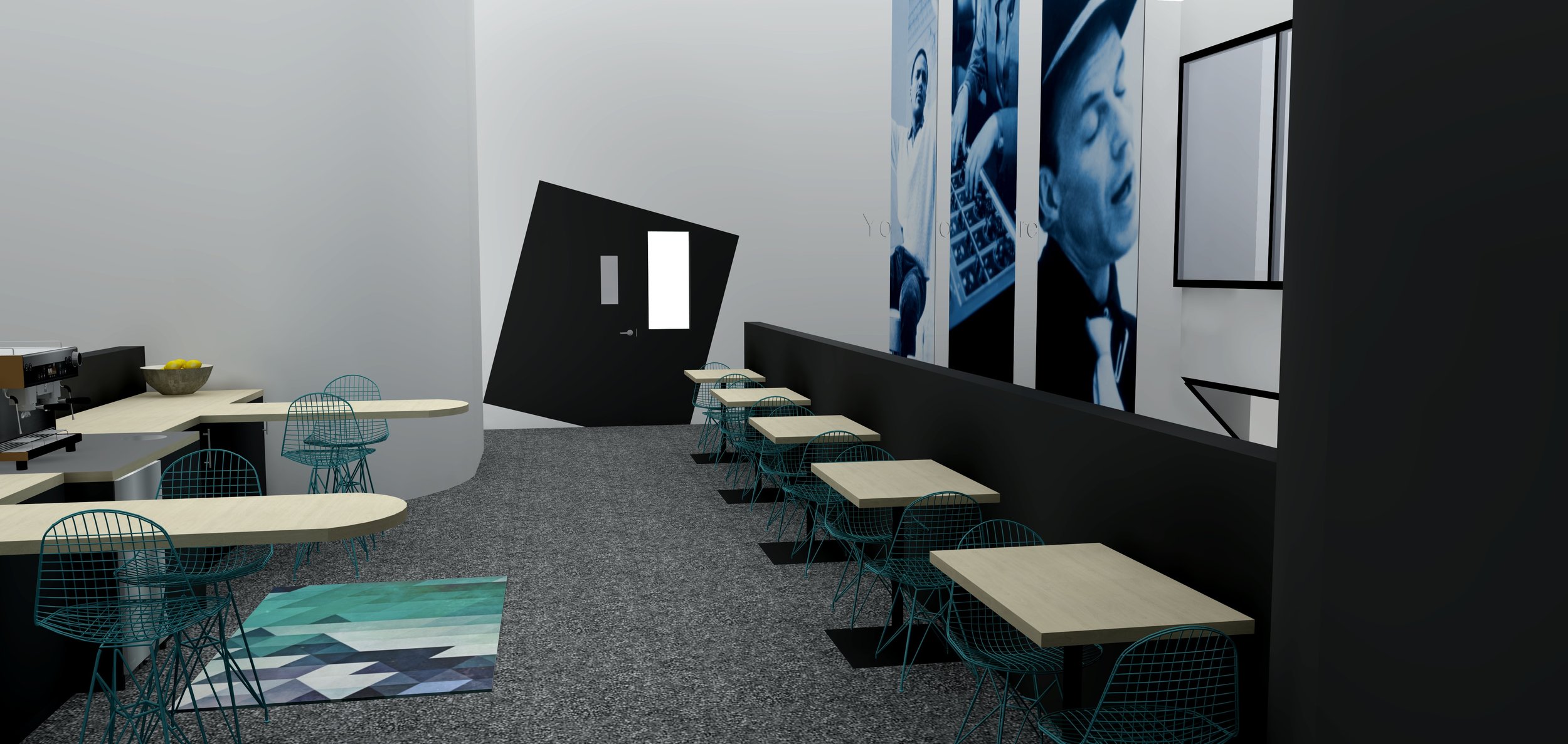
The second story mezzanine has a great break out space mainly used for coffee making and chess playing. The main issues here were the lack of storage and the barstools were too high for the counters. 

This is what we designed:

This is a rendering of our design:

This is the finished mezzanine with a carpet we designed using FLOR carpet tiles:

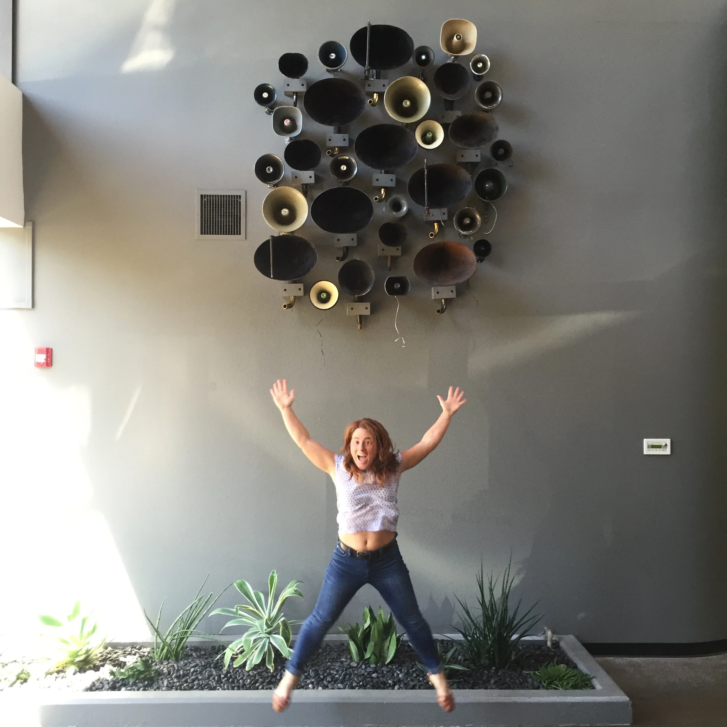
One of the final finishing touches is the installation of vintage speakers and phonograph horns which inhabits the double height entrance wall in the space between the two floors.  (Showing one happy client!)


We have a couple of little details to finish up before taking some professional photos of the completed space but we couldn't wait to show you all the progress. 

If you are interested in keeping up with us on a daily basis throughout the week, please follow us on instagram. Our username is stripedesignservices

Color: Netural

Color continues to inspire us but playing with color does not strictly mean playing with bold colors. Mixing and matching different neutrals creates that perfect opportunity for subtle visual dimension. Sometimes using strictly neutrals can make a space feel really elegant and confident. 

Take a look at a photo collection of neutral colors we are inspired by:

//1//2//3//4//5//6//7//8//9//10//

Keep following our Color pinterest board for new pins.